Sunday 14 July 2013

Magazine References

Image 1 - Restaurant Ad

Image 2 - Contents page


Image 3 - Coupon/Discount Ad

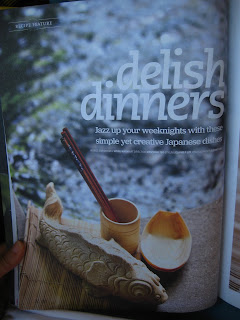
Image 4 - Recipe

Image 5 - Introduction of new section in magazine

Image 6 - Introduction of new section in magazine

Image 7 - Recipe

Image 8 - Illustrated Ad

Image 9 - Introduction to new section in magazine

Image 10 - Recipe page layout

Image 11 - Interesting food Ad

Image 12 - Introduction to new section of magazine

Image 13 - simple and interesting ad

Image 14 - Page layour

Image 15 - Page header to indicate which section 

Image 16 - Introduction to new section of magazine

Image 17 - magazine ad

Images 5, 6, 9, 12, 16 page layout is used in my magazine design. For each section of my magazine I have an introduction page in relation to what are the contents that would be in the next following pages. I would have a title for that section and a little quote underneath it, also in relation to the title itself. Please refer to the previous post Final On Screen to view the different sections of the magazine. They are pages 7, 13, 21, 27.

Friday 12 July 2013

Final on Screen

Cover page


Advertisements 
Pages 2 - 3

Contents Page
Pages 4 - 5

Advertisement and Section Introduction
Page 6 - 7


Breakfast Article
Pages 8 - 9

Quick Recipes
Pages 10 - 11

Japanese Soy Sauce Ad & Japanese Food section introduction
Pages 12 - 13

About Japanese Restaurant Master Chef & Food
Pages 14 - 15

Restaurant Kaiseki Yoshiyuki Interior Design
Pages 16 - 17

Continuation of Restaurant Kaiseki Yoshiyuki's Interior Design.
Fine Dining Red Wine Ad. 

Pages 18 - 19

Drools Magazine Self Promotion Ad.
Featured French Delicacies section introduction.

Includes Nutrition Facts.
Pages 20 - 21

Eiffel Tower Restaurant Entrance, Paris View & Food.
Pages 22 - 23

Laduree Story and Introduction of Macarons.
Pages 24 - 25

Popular Laduree Cakes & Pastries.
Dessert section introduction.
Pages 26 - 27

Photo of big cake and some desserts in the background.
Article on Benefits of eating desserts.
Pages 28 - 29

Advertisements of Majestic Hotel.
Pages 30 - 31

Tea Advertisement.
Back Cover.
Pages 32


Magazine Layout and Design

Image 1 - Pages 1-17

Image 2 - Pages 18-32


Thursday 11 July 2013

Cover Page design progress

Image 1 - Placing of background with Masthead.

First picture from the left shows overall of background photo. No emphasis of what is more important.
2nd picture shows more of the person and what his holding and less of the background.
3rd picture shows more emphasis on the food. Less on the person and background.


Below is an example from my progress. Photo of girl eating carrot does not belong to me.
Image 2 - showing everything in the picture
Image 3 - Emphasis on girl. 


Image 4 - Emphasis on carrot.
Less on the girl because she is not the main topic.
She is also not an important person.

Masthead Design Progress

Masthead definition:
- The title of a newspaper or magazine at the head of the front or editorial page.


My first idea for this magazine assignment is to do on pets. 

Sketch 1 - Masthead design for Pet Magazine
I did not do much on the pet magazine masthead designs as there were a some classmates doing on pets as well.


So I decided to change to a desserts magazine.

Sketch 2 - Names and slogans for Dessert Magazine

So I listed down a few names and slogans.
Feedback from lecturer was that Dessert Days just too common.
Sweet Talk was just ok.
Drools is good.


Sketch 3 - Drools magazine masthead and magazine design.

So, since the name Drools is good, my lecturer suggested why not do both food and desserts together.
Have a food magazine and a separate special edition desserts recipe magazine.
So I thought maybe have the magazine such as the front as food and the dessert at the back.
To distinguish the the difference between the 2 is by having it back to back and upside down.
(Refer to Sketch 3)
Started some Masthead designs.


Sketch 4

Tried to incorporate some food and eating utenciles into the masthead.


Image 5 - Final Drools Magazine Masthead